Grit.
Client
Grit.
Location
Belgrade
Year
2026
Info
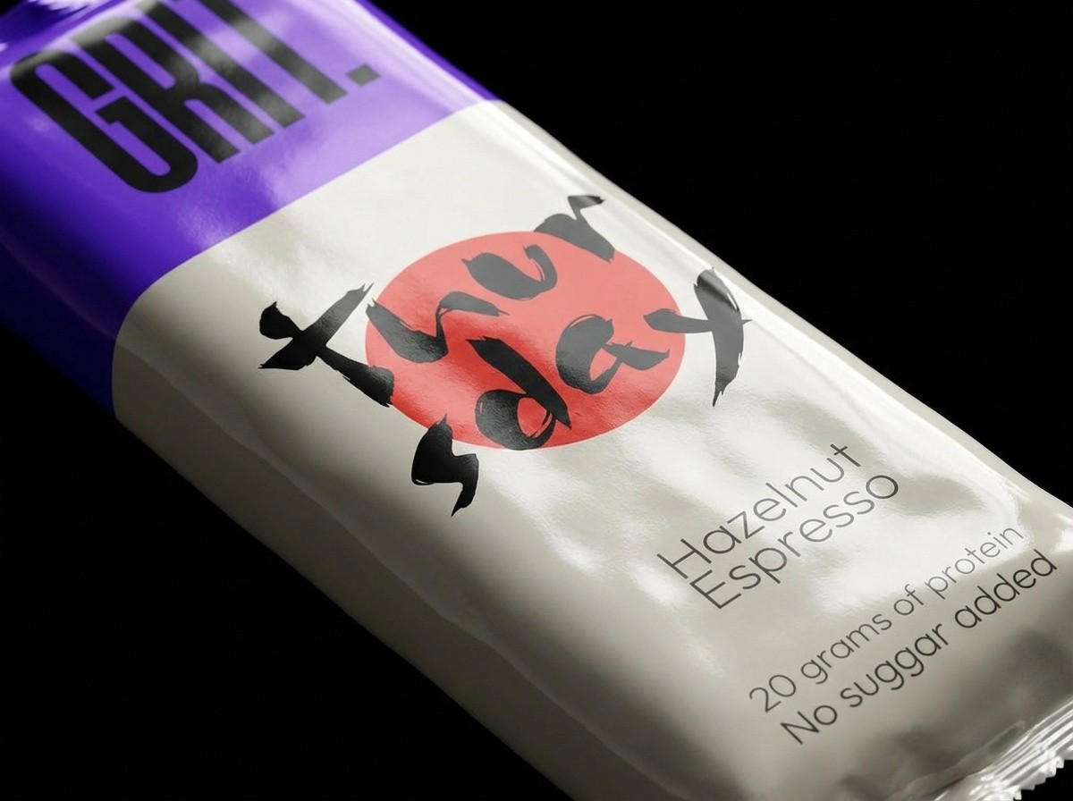
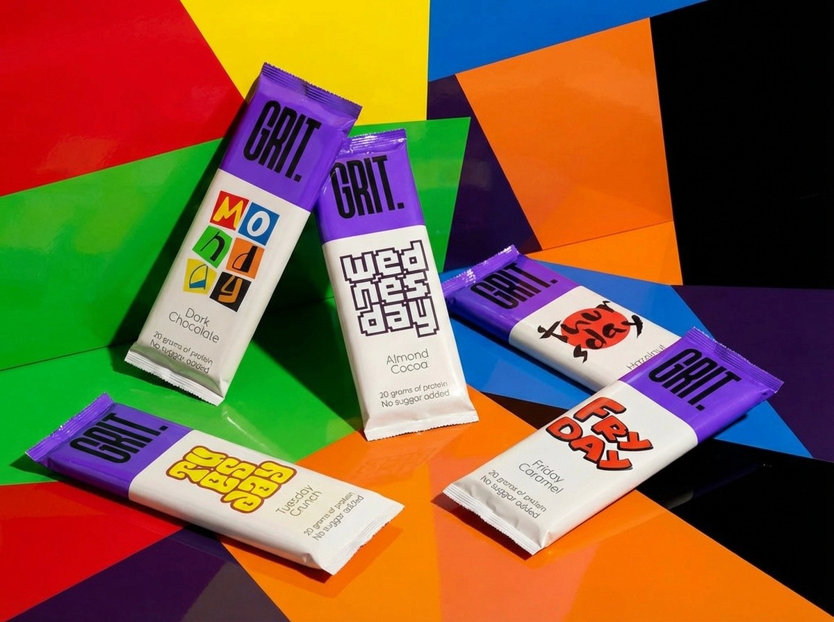
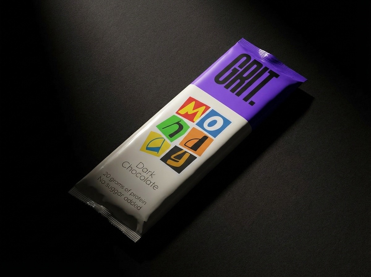
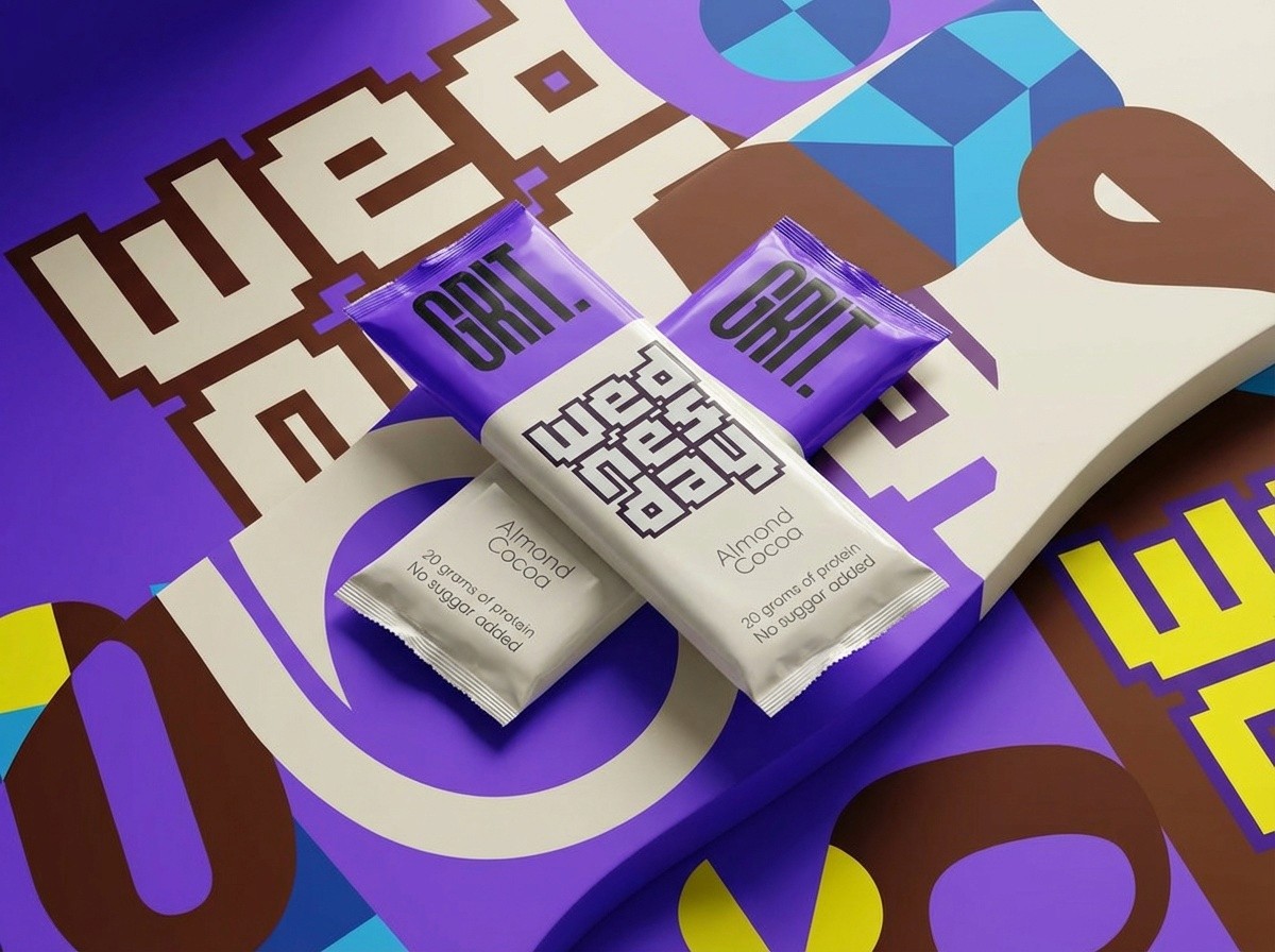
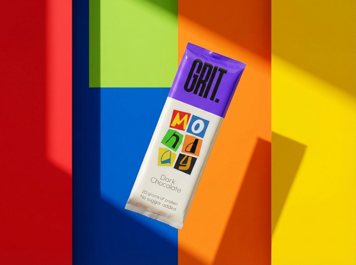
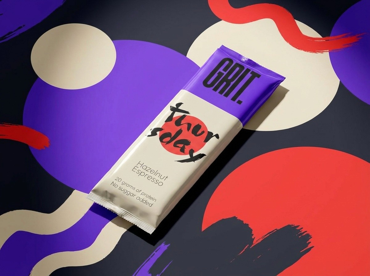
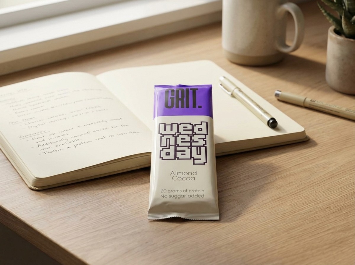
GRIT isn’t another “fitness” chocolate bar. The market is full of products shouting about macros and performance. GRIT was born as the perfect everyday chocolate — something you eat because you want to, not because you have to. It just happens to deliver 20g of protein, zero added sugar, and uncompromised taste.
Challenge & Insights.
The market was saturated with “fitness” chocolate bars shouting about macros, muscles, and performance. Most products try to justify indulgence with health claims. GRIT’s challenge was to create a chocolate bar that felt everyday, desirable, and premium, while still delivering functional benefits like 20g of protein and zero added sugar. The insight: people want chocolate because they enjoy it, not because it’s a workout supplement.
Solution & Impact.
GRIT redefines indulgence. The design focuses on lifestyle and attitude, not nutrition tables or sport aesthetics. It became a premium daily ritual — a chocolate you enjoy anytime, on the go, or between creative moments, while still getting functional benefits as a bonus. The packaging and visual identity communicate character, pleasure, and discipline, making GRIT stand out in a crowded market.