NutriSip

Client
NutriSip
Location
CST, Belgrade
Year
2025
Info
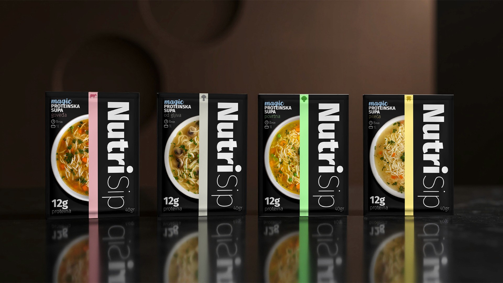
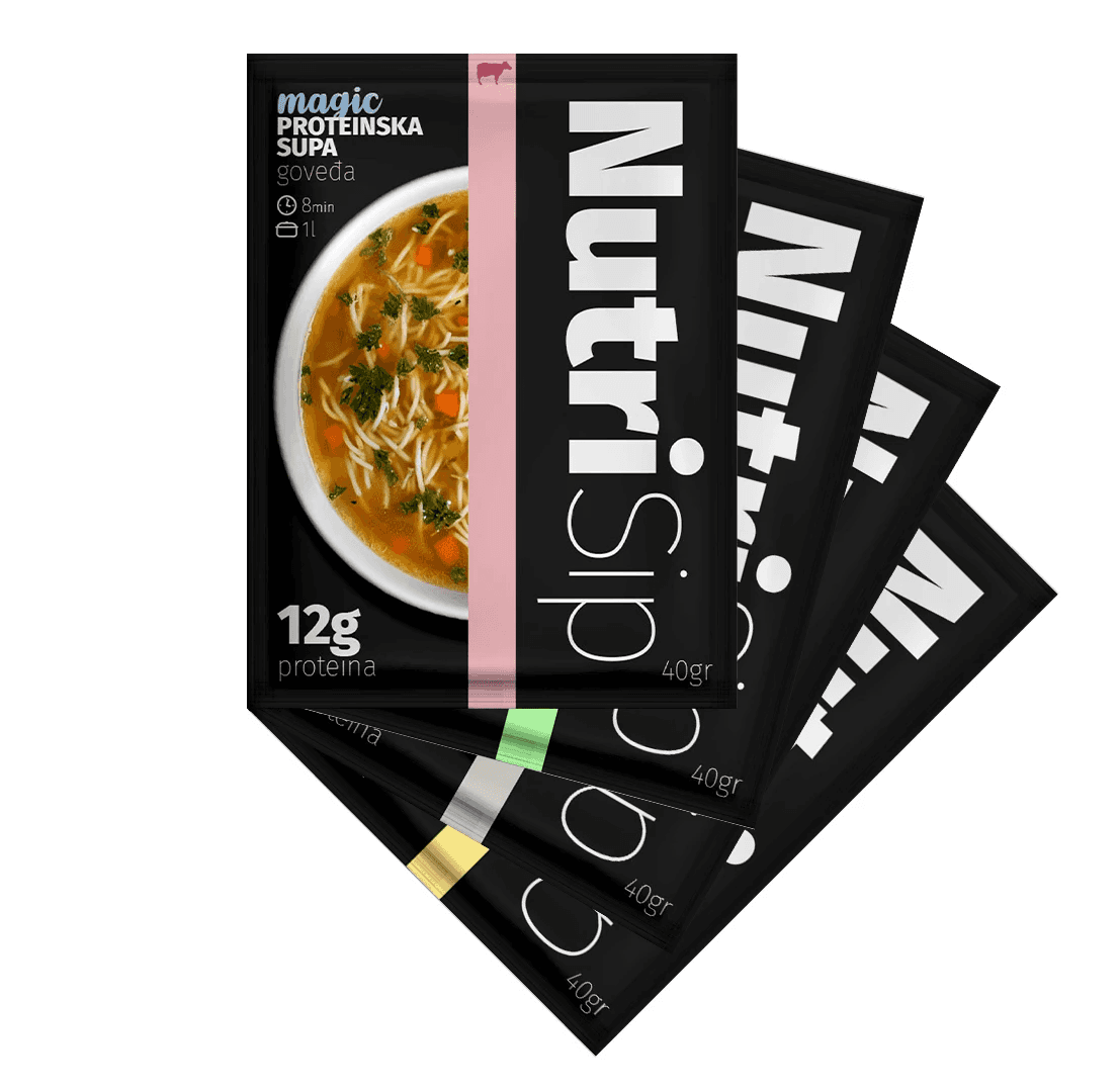
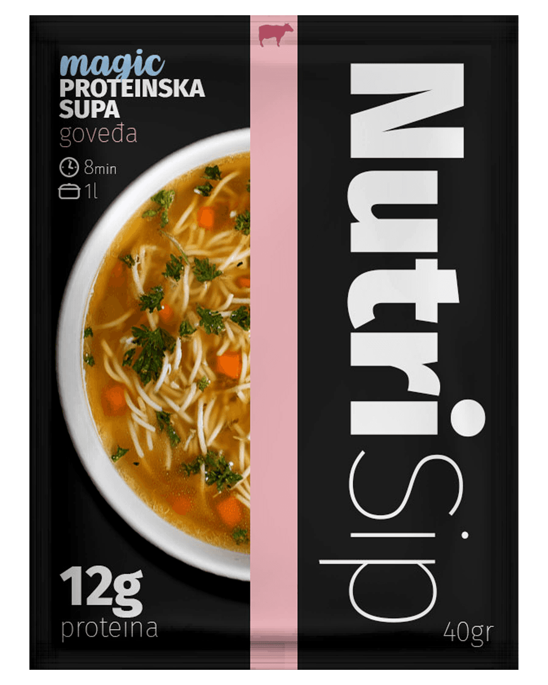
NutriSip is a newly developed instant protein soup product designed to combine functional nutrition with comforting, homemade flavor. The client needed a full creative solution — from naming the product to designing packaging that clearly communicates its protein value, fast preparation, and tasty, familiar character. The goal was to create a brand identity that feels modern, nutritious, and appealing to both fitness-oriented users and everyday consumers.
Challenge & Insights.
The challenge was to create a name and packaging system that stands out in a market dominated by either clinical-looking fitness products or traditional soup brands. The product required a balance between high nutritional value and warm, appetizing visual cues. Insights showed that consumers respond strongly to clear benefit communication (protein content, prep time, portion size) paired with an inviting food image and a clean, modern layout. This informed a direction that blends functional clarity with emotional, food-forward design.
Solution & Impact.
I created the name “NutriSip”, combining “nutrition” with the simplicity and comfort of sipping warm soup. It is short, catchy, and scalable for multiple flavors and product extensions. The packaging design features a strong vertical layout with bold typography, a recognizable color-coded stripe for flavor differentiation, and a hero soup image for appetite appeal. Key benefits — 12g protein, 8-minute prep, 1L serving — are highlighted in a clean, easy-to-scan hierarchy. The result is a modern, high-contrast packaging system that elevates the product, increases shelf visibility, and positions NutriSip as a unique hybrid between functional nutrition and comfort food. This design creates a strong foundation for a future product family and brand expansion.